// THE BRIEF //
GOALS
• Build a strong, quirky-yet-classy brand identity
• Design a full food truck wrap and branded packaging
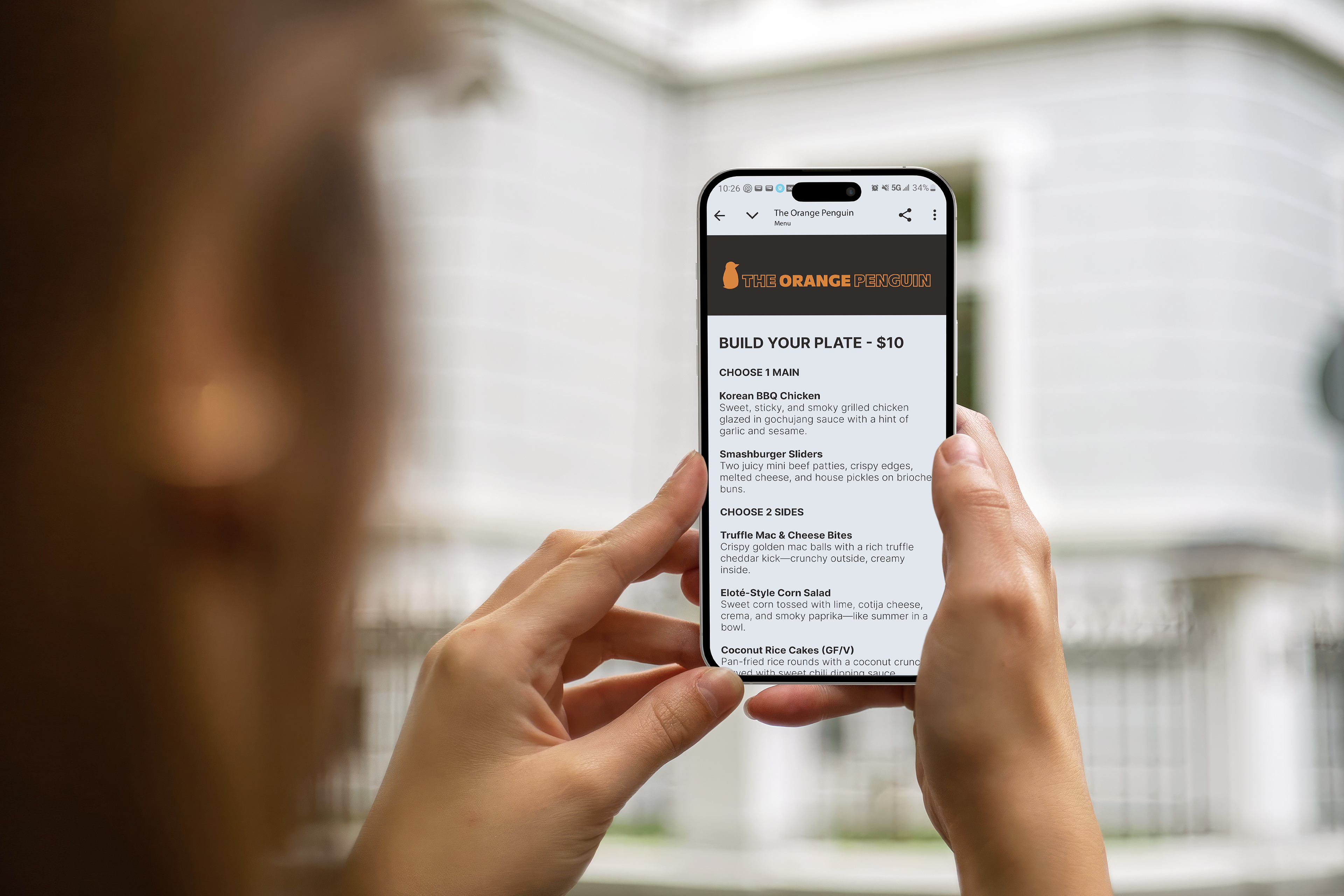
• Enhance user experience with a clean & simple mobile-friendly digital menu that customers can visit while standing in the anticipated long lines
• Create a brand presence that feels inclusive, cool, and memorable
AUDIENCE
The Orange Penguin is designed to appeal to adventurous eaters from all walks of life (i.e. students, professionals, weekend wanderers) This brand is for anyone who enjoys creative, affordable street food and values personality and convenience in their dining experience
DELIVERABLES
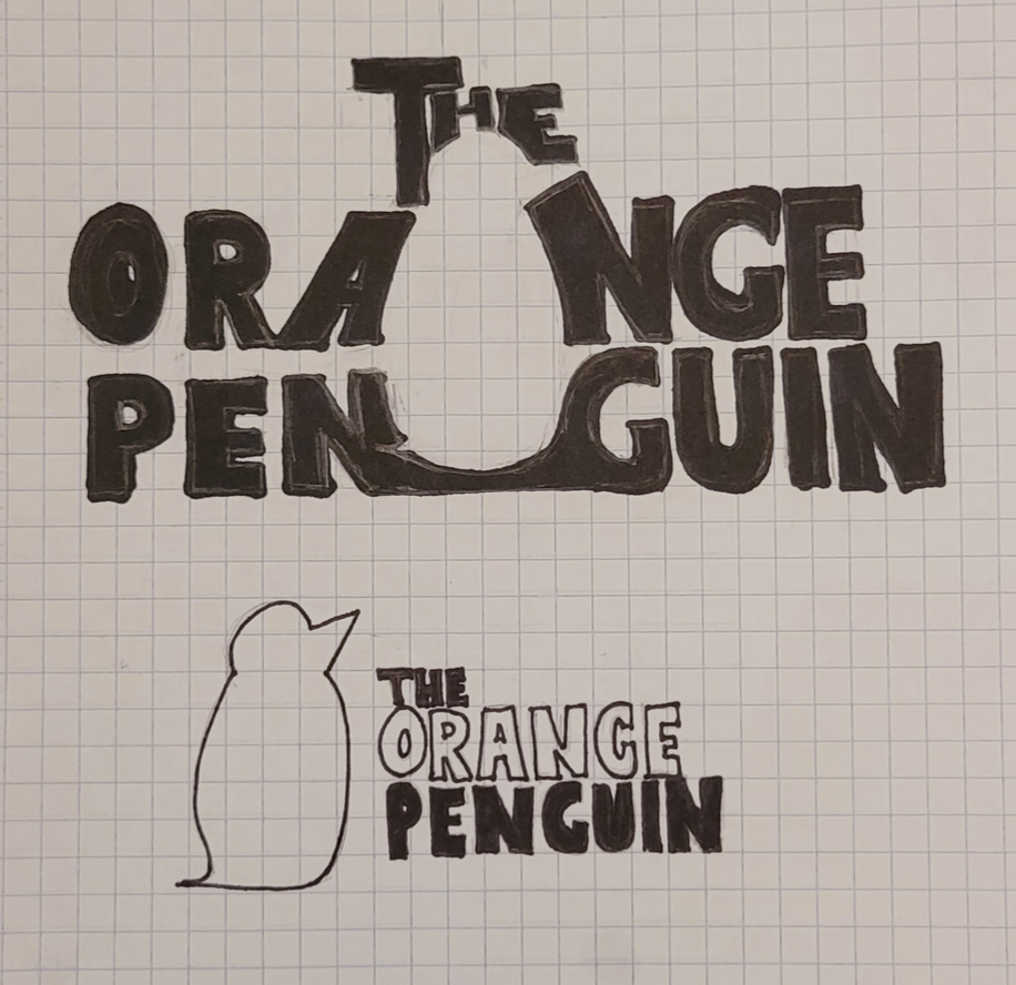
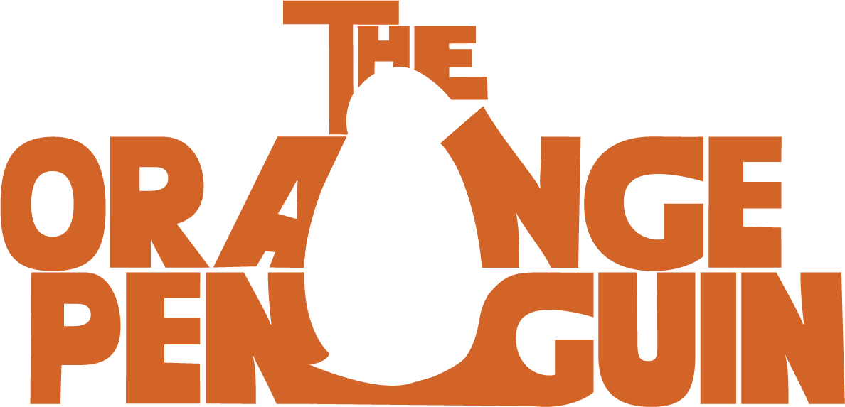
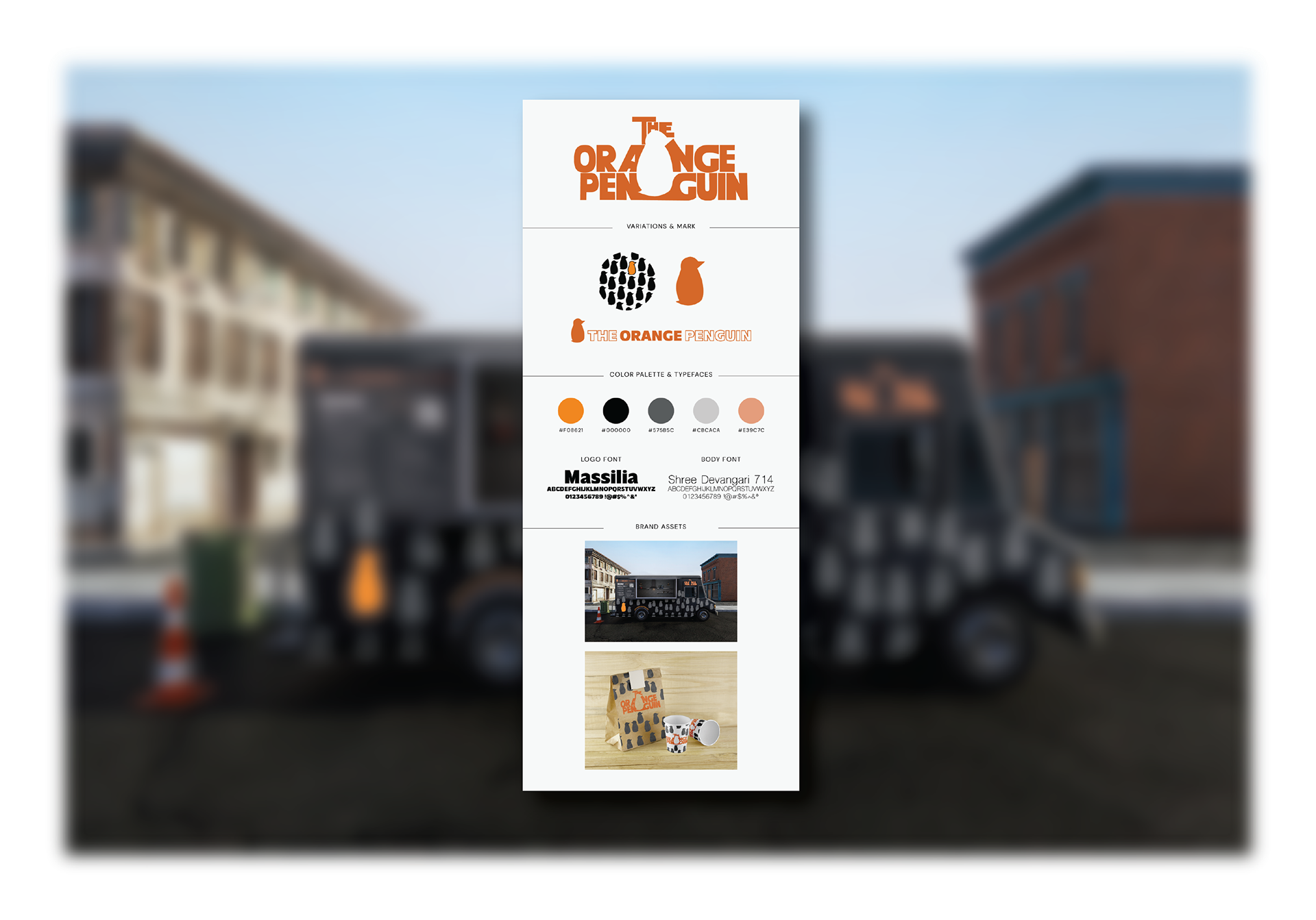
• Primary logo with logo-mark and type, plus alternate version
• Full brand identity kit and usage guidelines
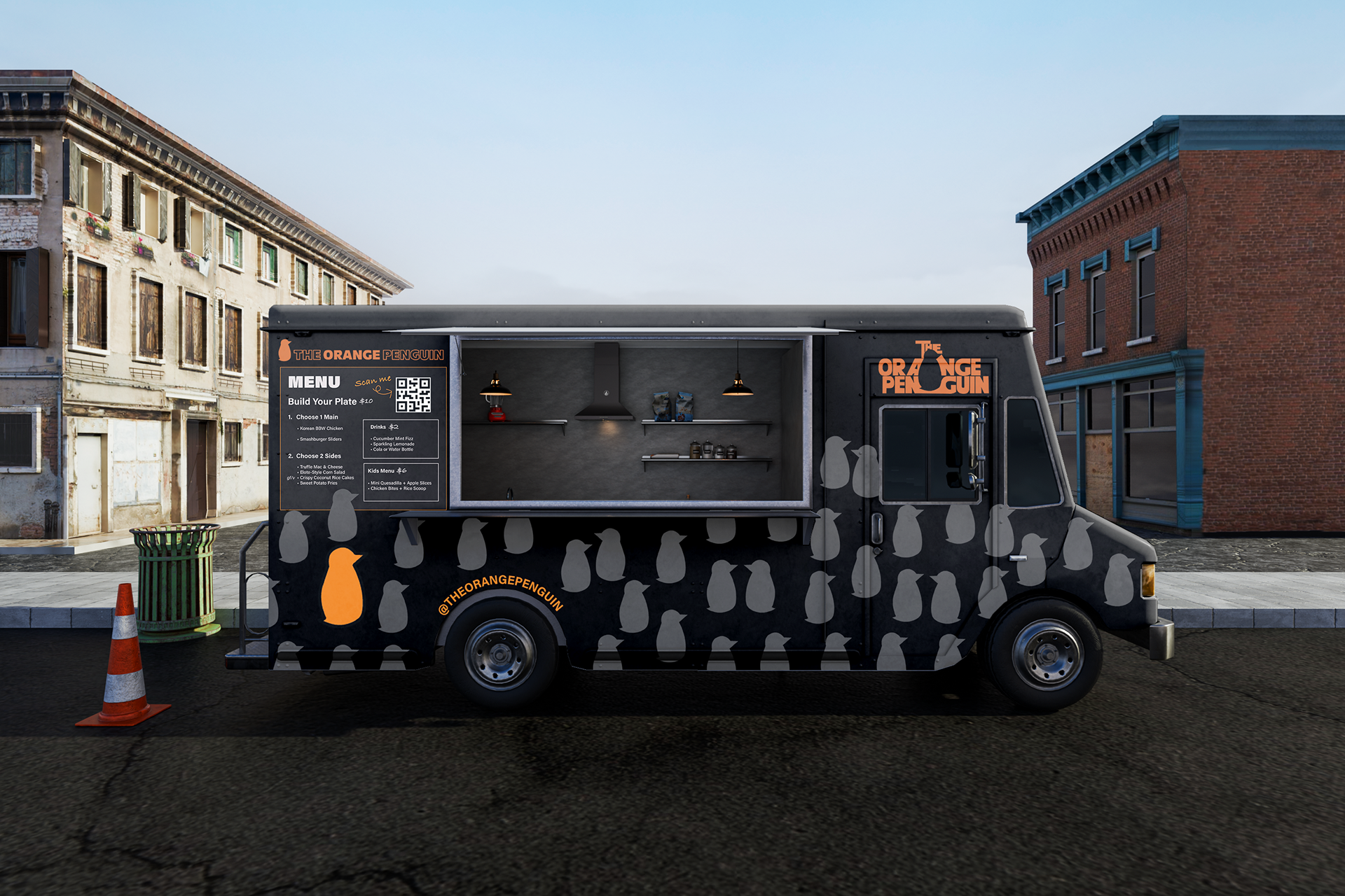
• Food truck wrap design using the “kit of parts”
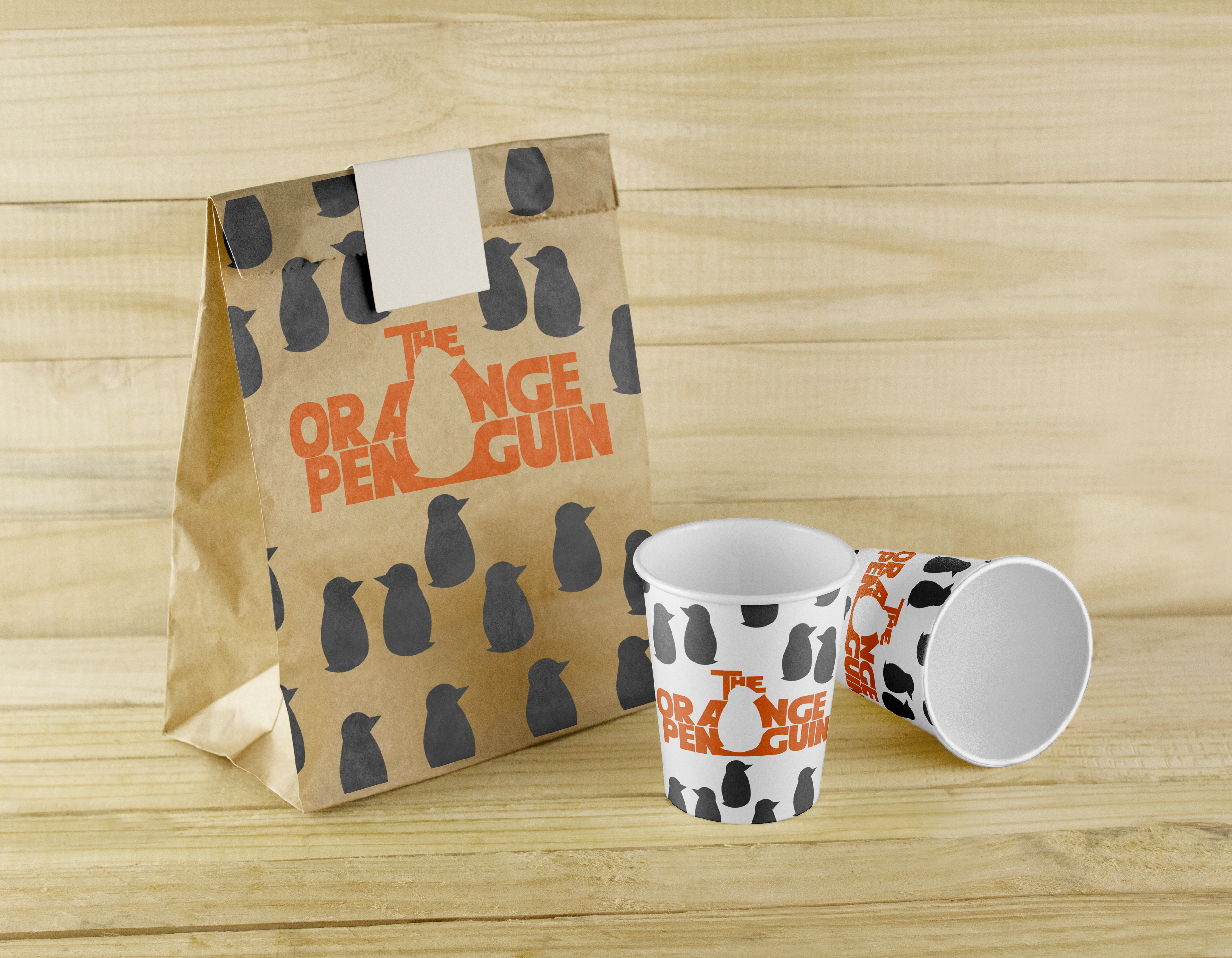
• Branded takeaway bag and drink cup
• Mobile menu screen mockup tied to a scannable QR code on the truck
// THE PROCESS //
CHALLENGES TO SOLVE
• Designing a logo and brand visuals that felt playful but still clean and modern
• Making the food truck highly visible and recognizable in busy or crowded spaces
• Ensuring all brand elements worked across multiple mediums, from physical signage and packaging to digital platforms
• Creating a flexible identity system that could evolve with the brand as it grows
RESEARCH & DISCOVERY
To begin, I explored the competitive landscape of food trucks (both locally and nationally) to identify visual patterns and gaps in the market. I analyzed how existing brands communicate their personality through color, typography, and layout, with special attention to those that appeal to younger, on-the-go audiences. I also gathered insights into consumer behavior at food trucks, noting the importance of fast recognition, clear signage, and digital accessibility (such as QR code menus).
// THE SOLUTION //
DESIGN DECISIONS
Imagery: The concept of one orange penguin standing out reflects the brand’s quirky, one-of-a-kind spirit in a sea of ordinary.
Typography: A bold sans-serif font was selected to feel contemporary, fun, and readable at all sizes—from the truck signage to mobile menus.
Color Palette: Rich orange evokes appetite and vibrancy, while matte black adds contrast, sophistication, and helps the orange pop.
Layout: The logo and graphics were adjusted based on feedback to ensure balance, legibility, and strong visual flow on the truck and packaging.
Functionality: The QR code menu is an intentional UX touch, designed to enhance convenience and reduce line frustration
The Orange Penguin brand identity delivers a bold, approachable, and distinctly memorable presence. The main logo features a playful penguin icon standing out in orange among a group of neutral-toned penguins, reinforcing the brand’s promise to be unique and unexpected. The supporting brand system includes a clear logotype and variation for flexible usage across mediums, from signage to social media.
A sleek matte black food truck wrap with bold pops of orange grabs attention without overwhelming the eye, balancing edge and approachability. Custom packaging (cups and bags) extends the brand experience, while a digital menu accessed via a QR code adds functionality and convenience for customers waiting in line—keeping things streamlined, efficient, and modern.