VISUAL INSPIRATION & MOODBOARDING
Mood boards were developed for each version, sourcing imagery that evoked either contemplative, organic living (Kinfolk) or bold, surf-and-sea culture (Session), while also tying to the article topic of "work-life balance". Layout studies focused on how image pacing, scale, and text relationships shift across different editorial tones.
SKETCHES & LAYOUT IDEATION
Initial sketches explored how to maintain a strong visual hierarchy while balancing negative space, images, and minimal text. Drafts included explorations of asymmetrical layouts, full-bleed photos, and floating type to best match each magazine’s rhythm and voice. I typically strive for 2-3 concepts before moving forward with one.
TYPOGRAPHY & COLOR
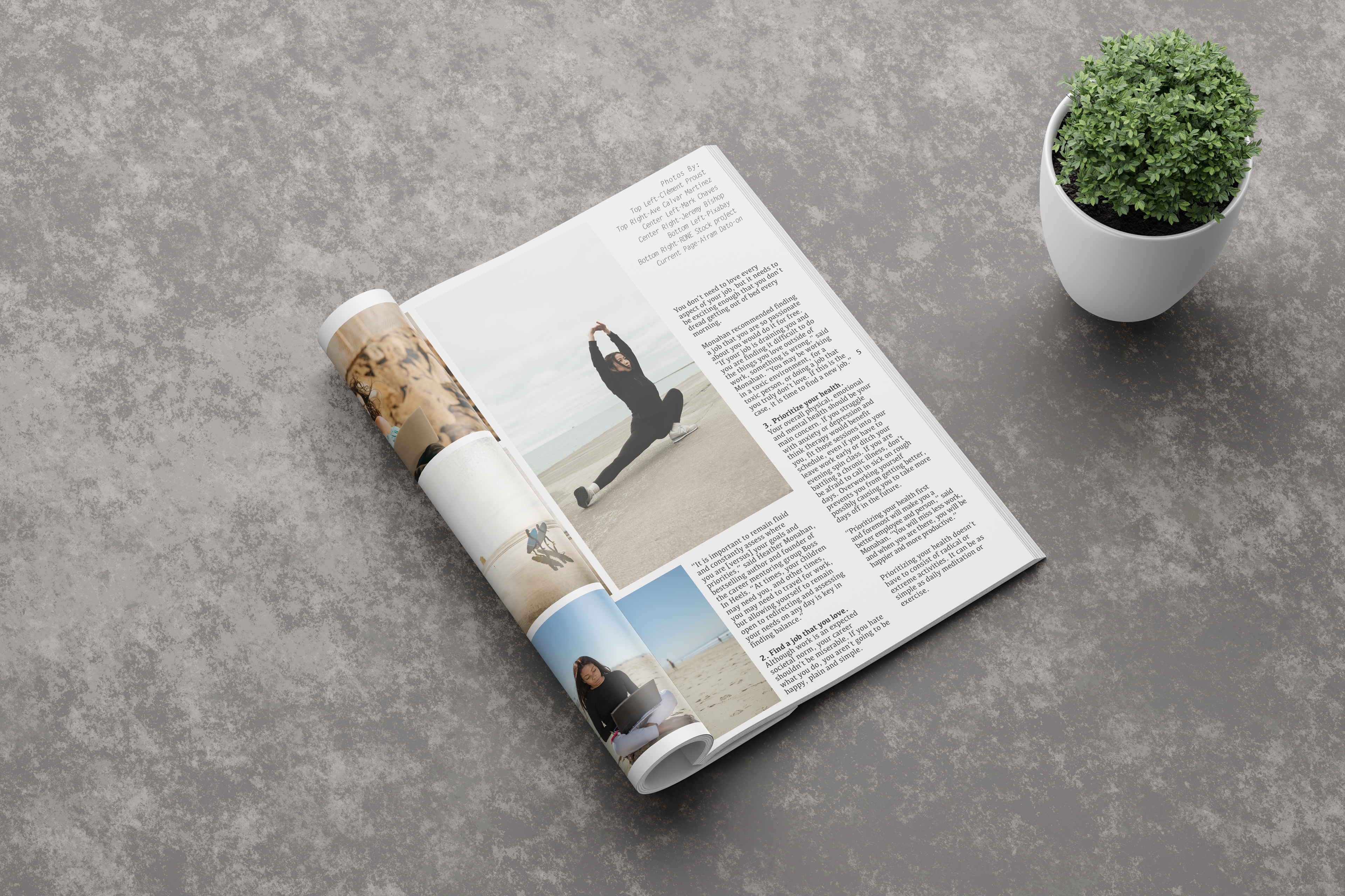
The Kinfolk spread featured modern sans-serif font with bold color blocking throughout, and generous white space for a refined, airy feel. The Session version used a typewriter-style typeface for titles/subtitles, and plenty of white space with layered imagery (featuring different bleeds for visual guidance through the layout).