// THE BRIEF //
GOALS
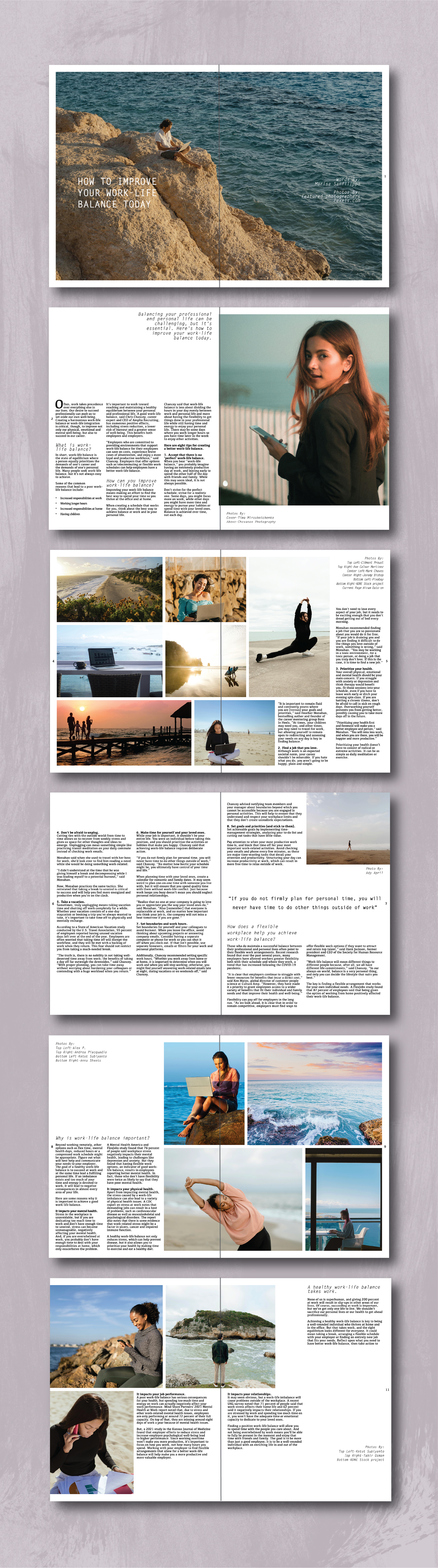
Design a magazine article spread that thoughtfully pairs original content with compelling visuals, rooted in a clear, audience-specific aesthetic. The goal was to develop a two-page feature that reflects the visual language, layout strategies, and tone of a selected publication.
AUDIENCE
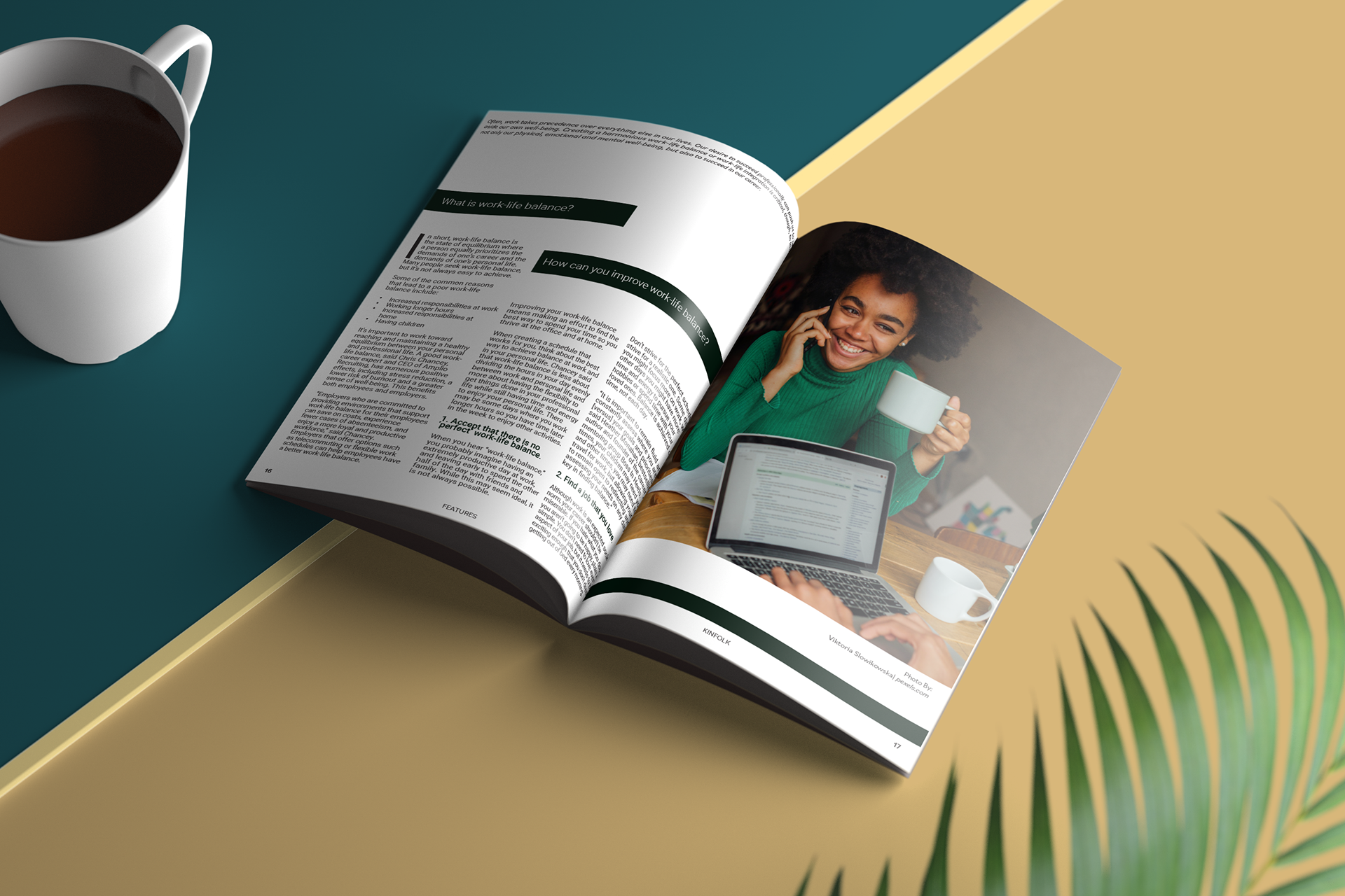
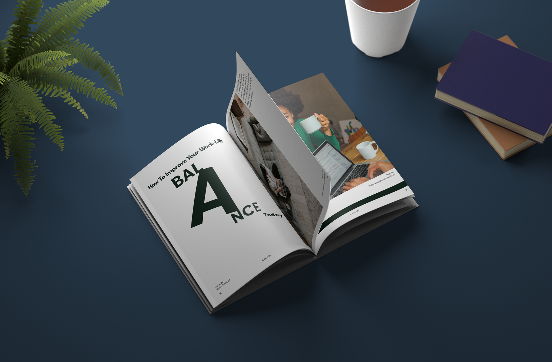
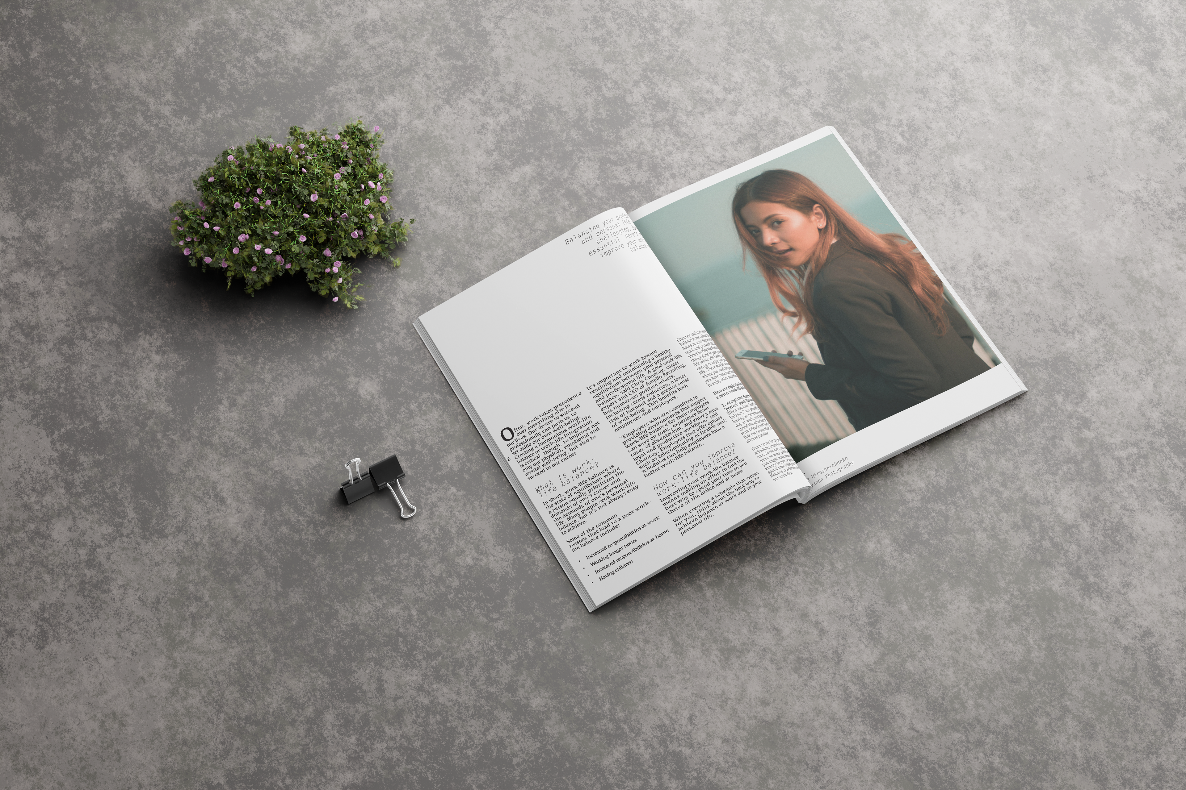
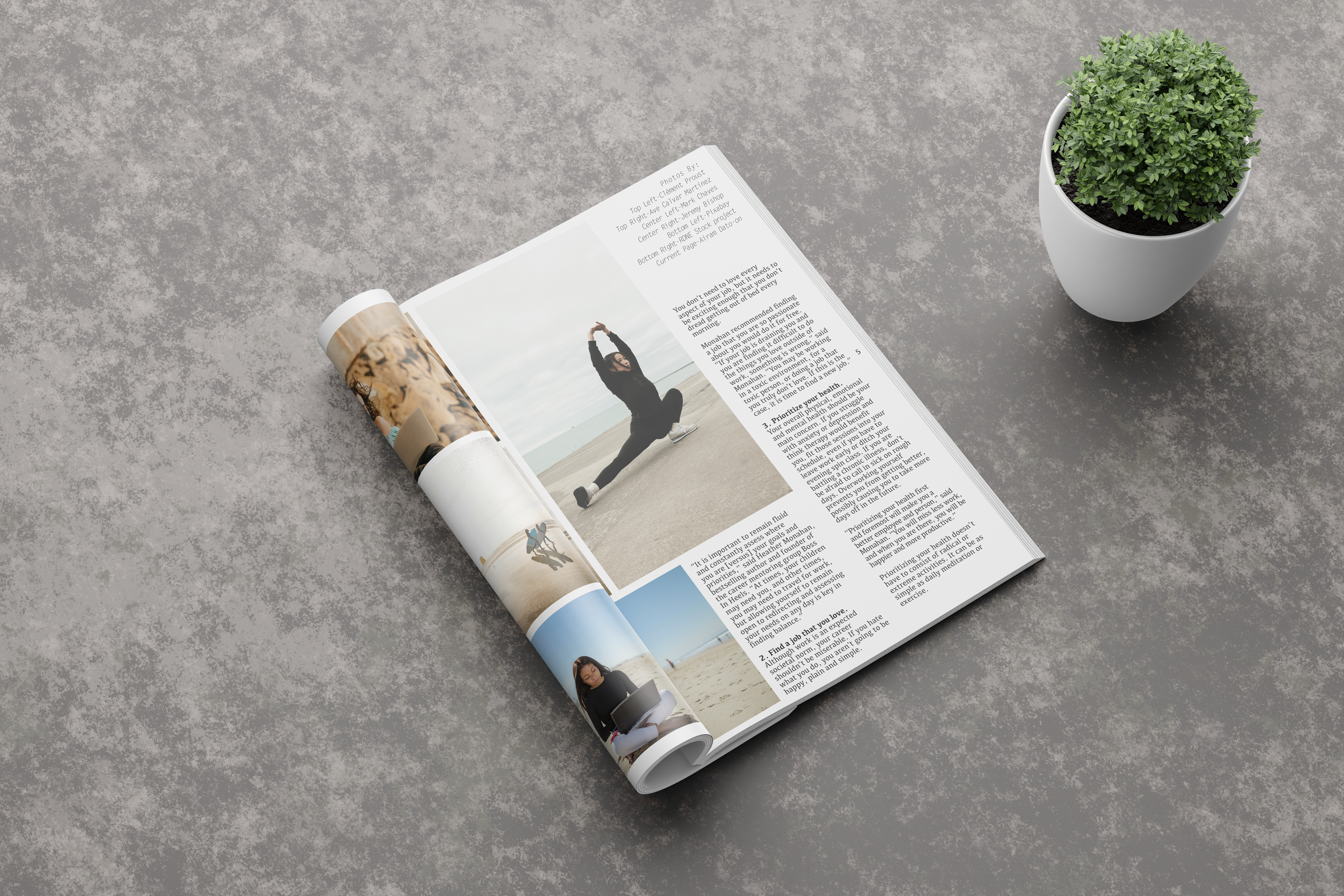
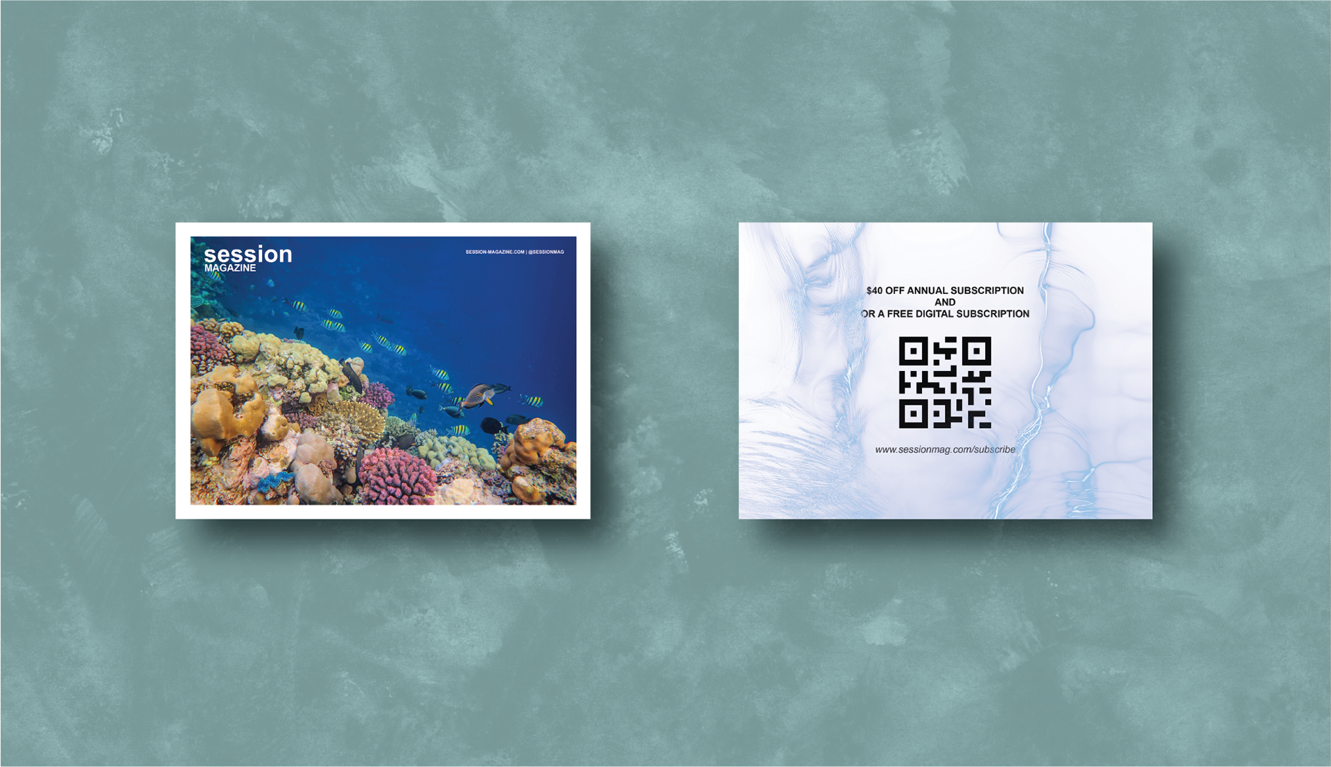
Two unique reader demographics were considered. One aligned with the slow-living, artistic sensibilities of Kinfolk, and the other geared toward the active, coastal-lifestyle readers of Session for Water Lovers.
DELIVERABLES
• Two distinct article spread designs (Kinfolk-inspired & Session-inspired)
• In-situation mockups for editorial presentation + Bonus: postcard insert
• In-situation mockups for editorial presentation + Bonus: postcard insert
// THE PROCESS //
CHALLENGES TO SOLVE
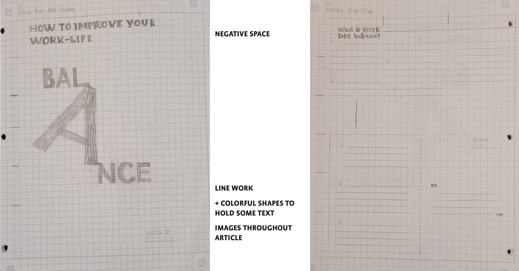
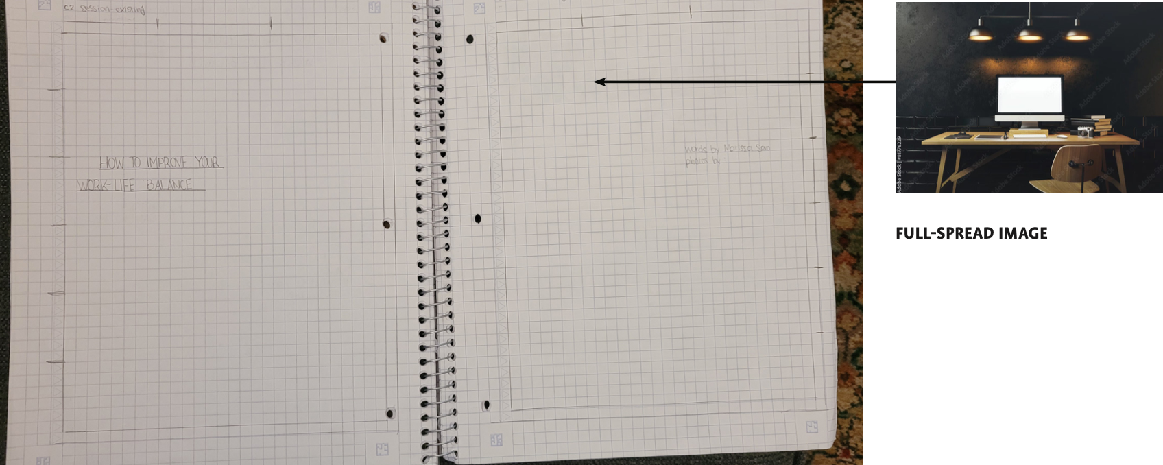
Adapting a single article to suit two entirely different editorial styles required careful restraint in both typography and imagery. Each version needed to feel authentic to the magazine’s visual language while remaining clear and readable.
RESEARCH & DISCOVERY
An in-depth analysis of existing editorial spreads from Kinfolk and Session revealed how both publications use grid systems, white space, and imagery to guide the reader. The project began with visual audits of existing magazines and style guides to inform tone and typographic pairing.
// THE SOLUTION //
DESIGN DECISIONS
• Created two distinct visual systems to suit Kinfolk and Session aesthetics
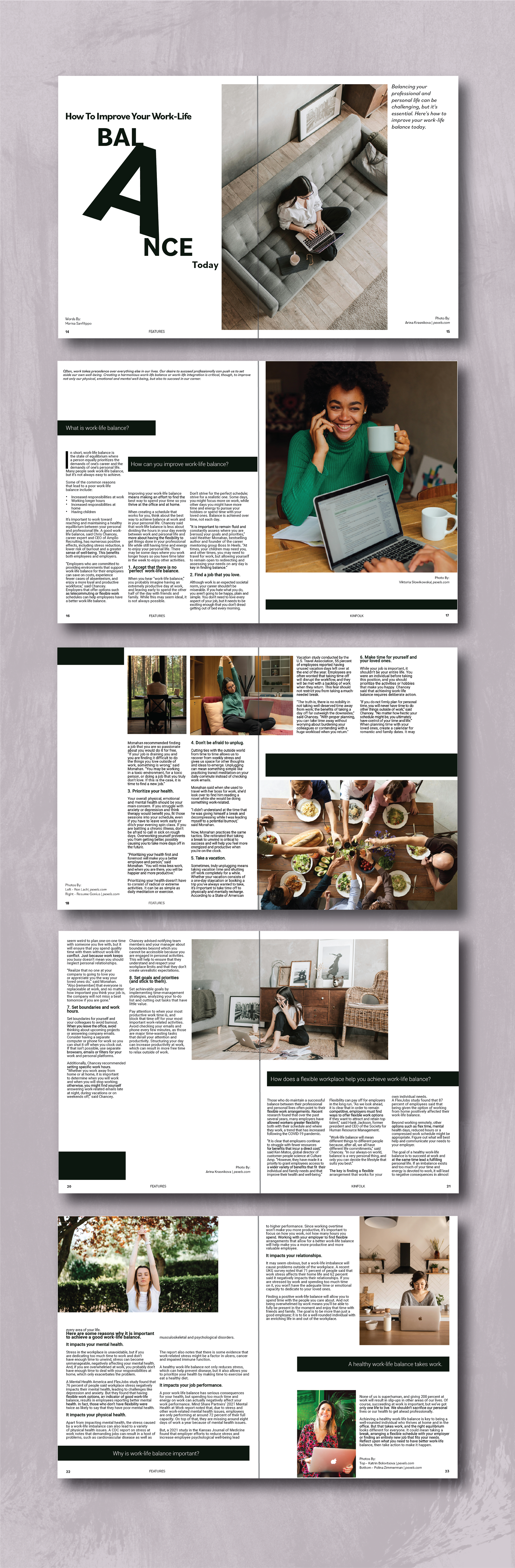
• Emphasized white space and quiet modernism for Kinfolk
• Used bolder color blocks and bleeds for Kinfolk
• Strategically placed headlines and pull quotes to enhance engagement
• Balanced imagery and text for smooth reading flow on both print and screen
• Emphasized white space and quiet modernism for Kinfolk
• Used bolder color blocks and bleeds for Kinfolk
• Strategically placed headlines and pull quotes to enhance engagement
• Balanced imagery and text for smooth reading flow on both print and screen
Each article layout functions as a stylized yet functional editorial piece, tailored for the visual preferences and reading flow of its respective audience. The final spreads reflect a clear understanding of editorial tone, audience appeal, and sophisticated layout structure.