// THE BRIEF //
GOALS
Create a cup design, takeout box, and tagline that communicates Dunkin’ as a complete breakfast destination - not just a coffee run - while staying true to the brand’s energetic, accessible identity.
AUDIENCE
Adults 18–40 • Busy professionals and parents • Fast-paced, routine-driven lifestyles • Regular morning commuters who value convenience, consistency, and comfort
DELIVERABLES
• Hot beverage cup design
• Takeout breakfast combo box
• Tagline / campaign punchline
// THE PROCESS //
CHALLENGES TO SOLVE
Dunkin’ is already synonymous with speed - how do you introduce intention without slowing the brand down?
How do you differentiate a breakfast combo in a market saturated with “fast fuel” messaging?
How can packaging itself tell a story in seconds?
RESEARCH & DISCOVERY
Through brand and audience research, I found that Dunkin’s core customers are constantly in motion. Rather than leaning further into urgency or productivity, I saw an opportunity to offer something different: permission to pause.
Even the busiest mornings contain micro-moments - standing in line, sitting in the car, taking the first sip of coffee. I chose to design for that moment.
// THE SOLUTION //
DESIGN DECISIONS
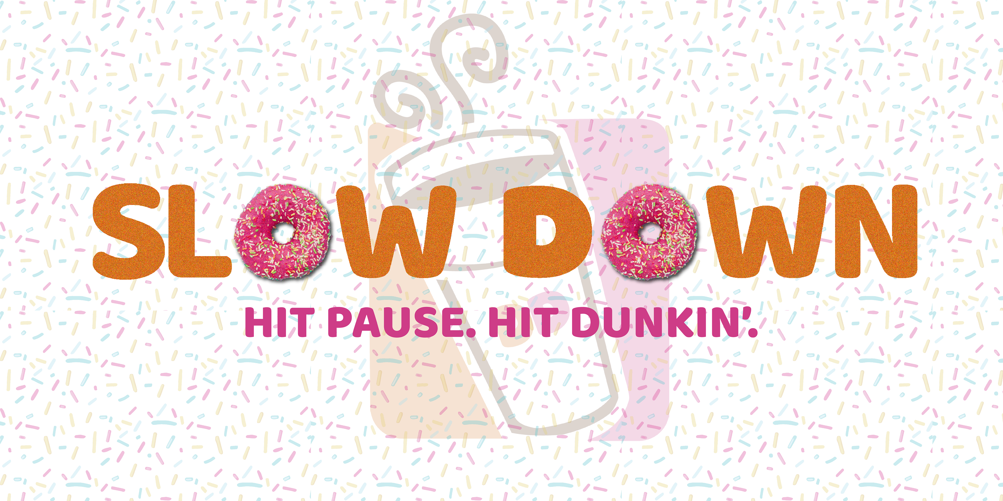
Tagline
Slow Down
Hit Pause. Hit Dunkin’.
Slow Down
Hit Pause. Hit Dunkin’.
Short, memorable, and rooted in everyday language—this phrase invites the customer to stop just long enough to enjoy their breakfast.
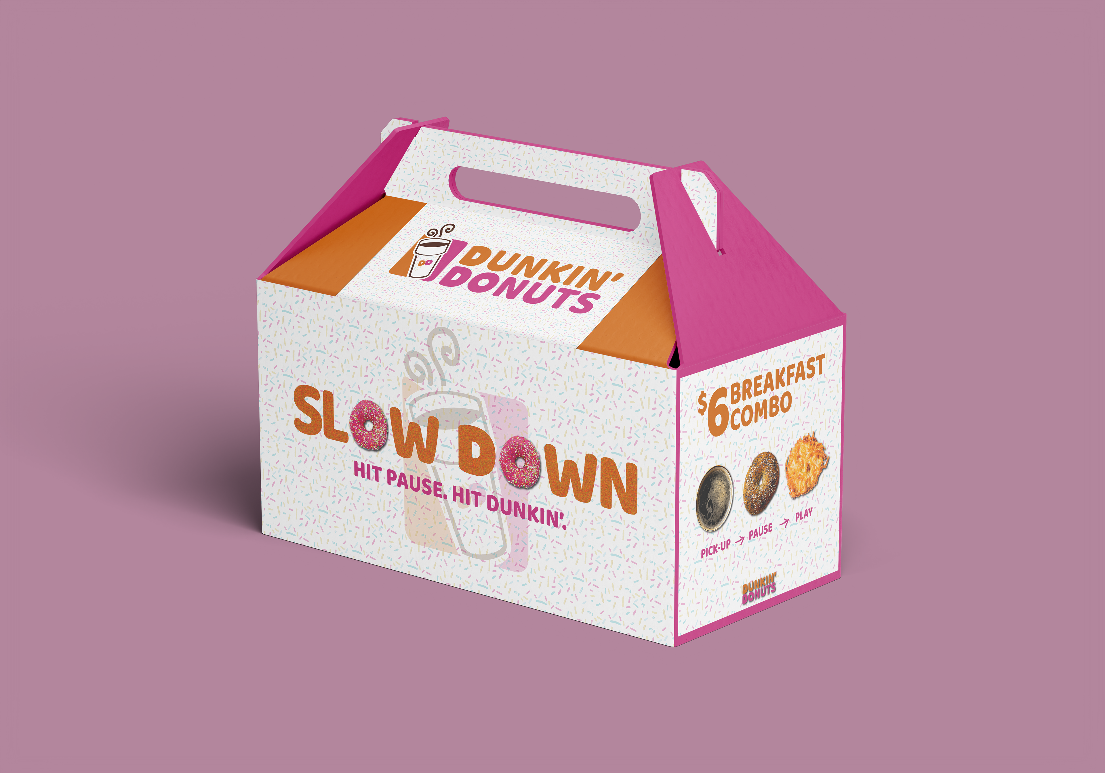
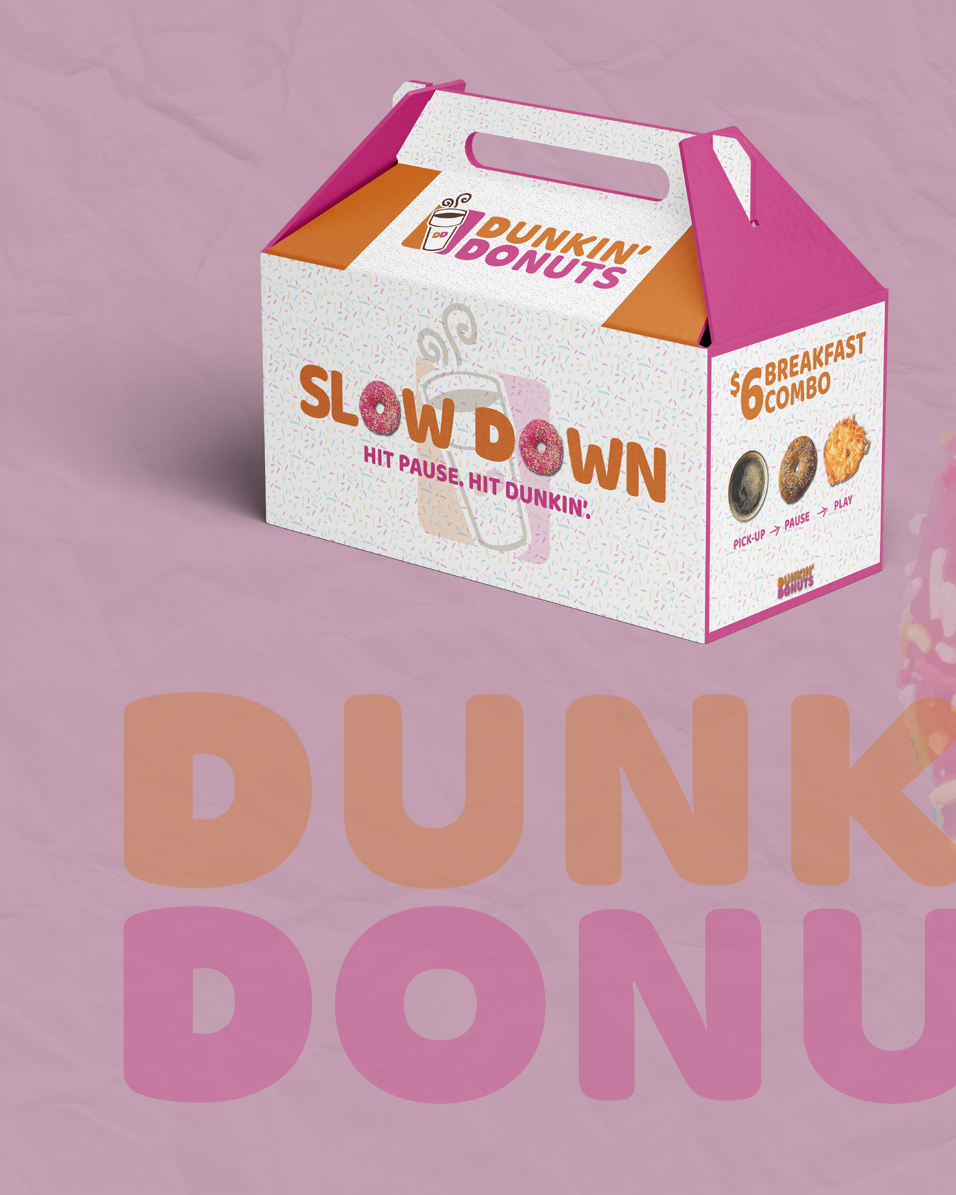
Takeout Box
The word “Slow Down” uses donut imagery for the “O’s,” reinforcing brand recognition while adding playfulness
Sprinkle-pattern background references Dunkin’ classics without overpowering the layout
Side panel highlights the $6 combo using circular food photography
Labels beneath each item—Pickup / Pause / Play—mirror music controls to reinforce the idea of stopping, enjoying, then continuing your day
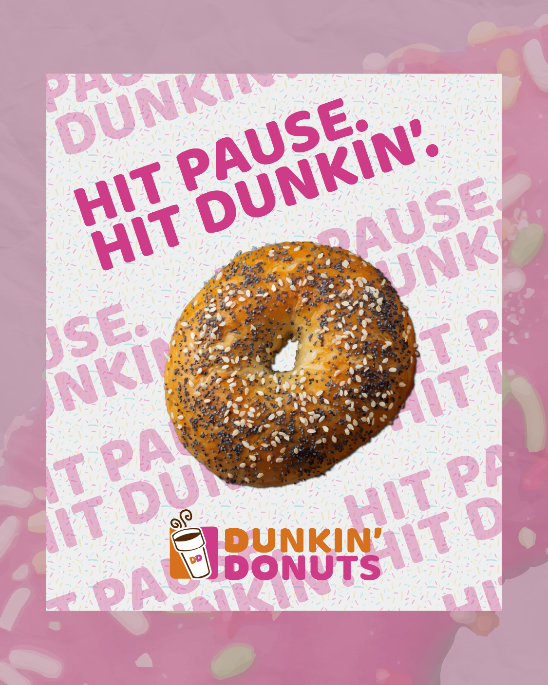
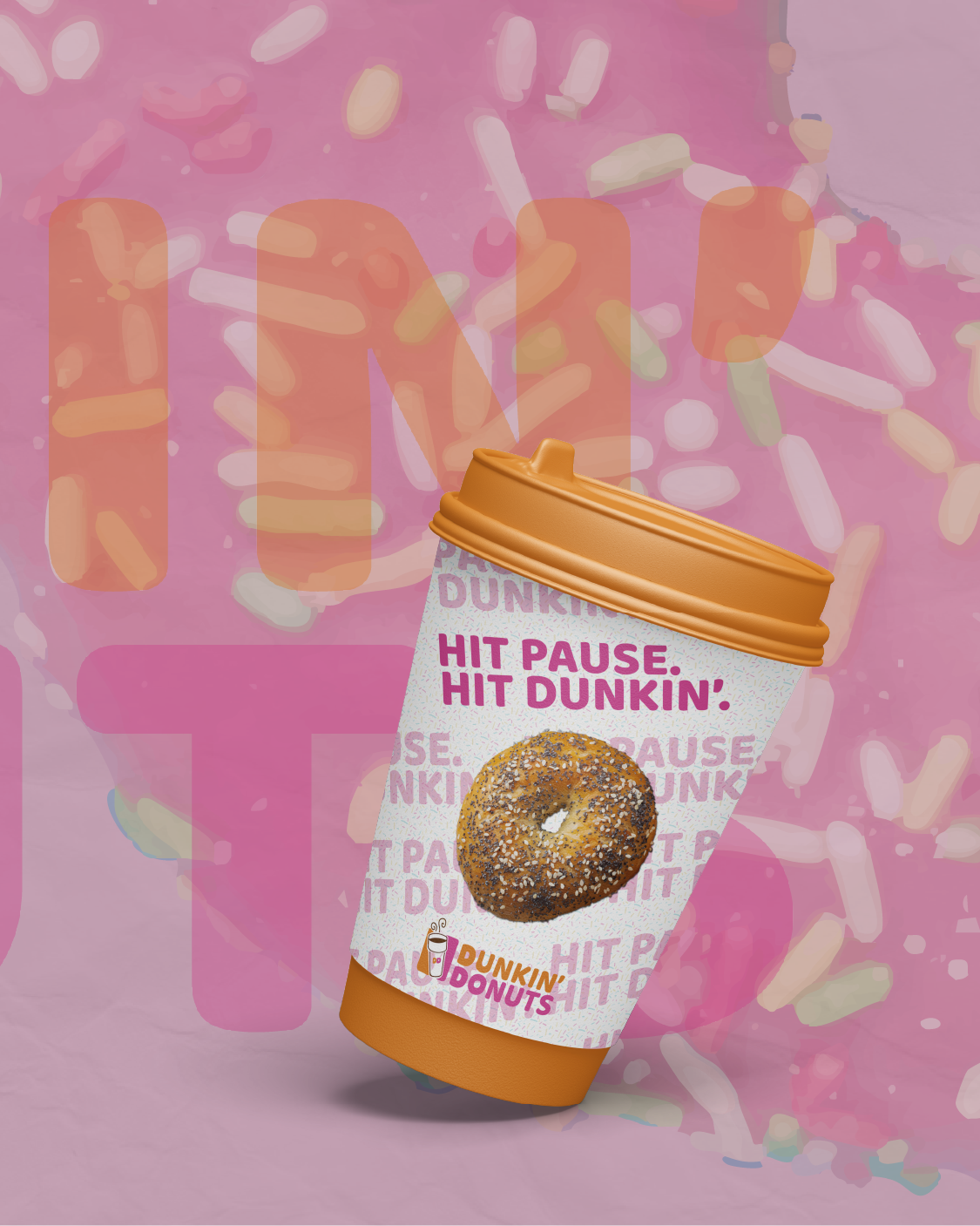
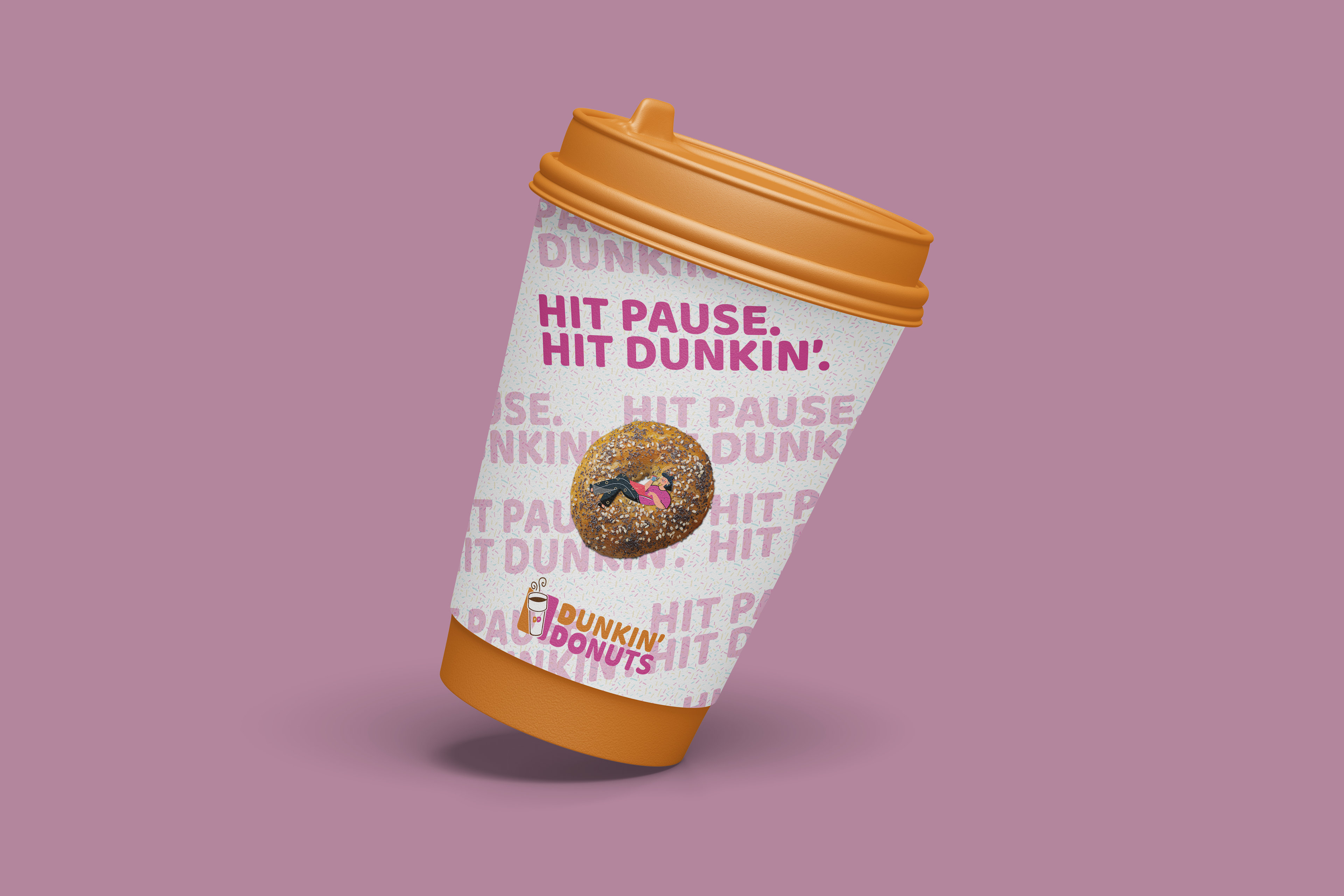
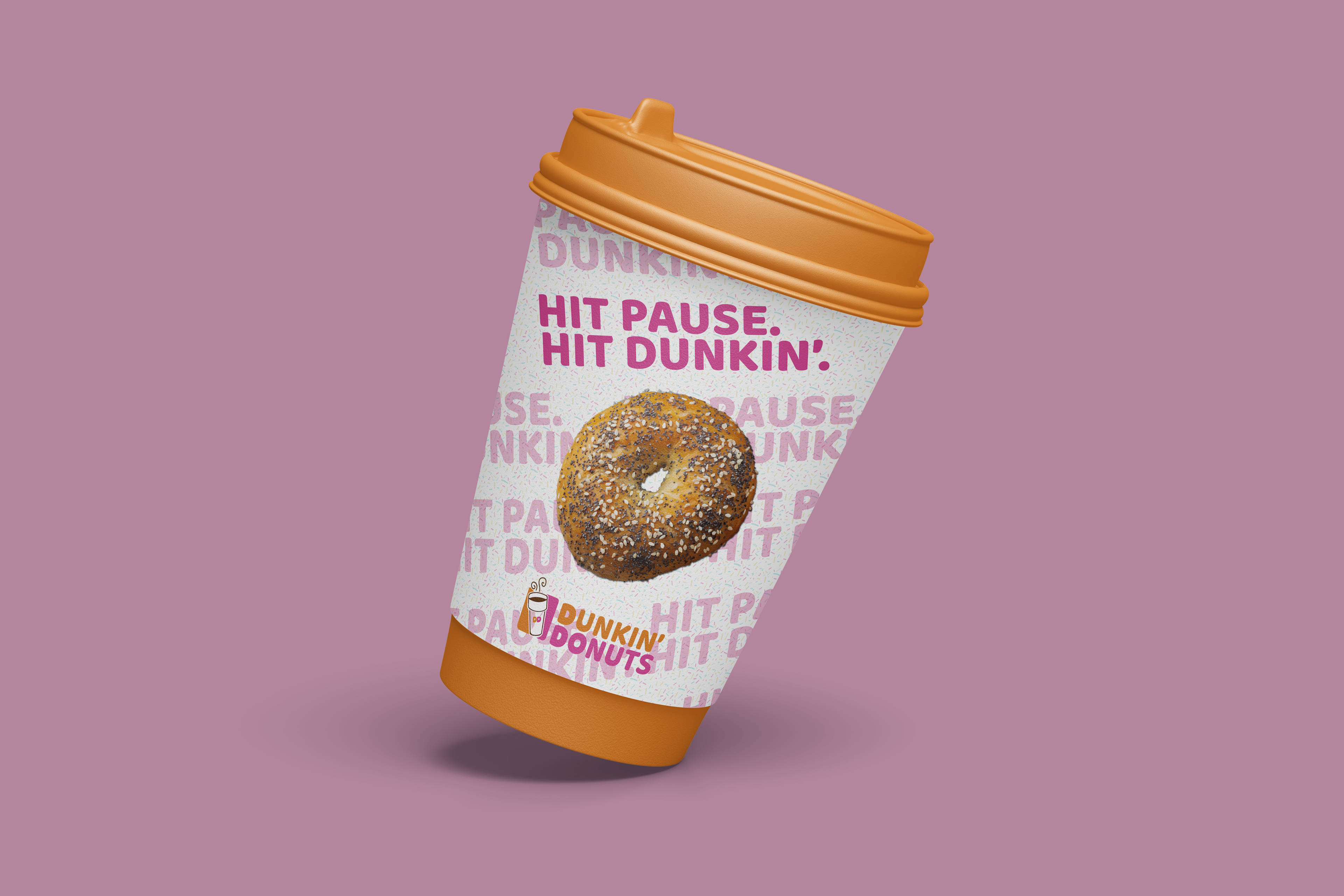
Cup Design
Repeating “Hit Pause. Hit Dunkin’.” creates movement and rhythm
One high-contrast phrase anchors the design for quick readability
Central bagel imagery ties the cup visually back to the breakfast offering
The overall layout remains bold, legible, and unmistakably Dunkin’
Final Thoughts
“Slow Down” reframes Dunkin’s breakfast combo as a moment of calm within a fast-paced life - not an escape from it.
Rather than selling speed, the campaign sells a pause worth taking.
This project was created as speculative work for educational and portfolio purposes only and is not associated with Dunkin’. The goal was to demonstrate strategic thinking, brand sensitivity, and the ability to translate insight into tangible design solutions.